7 Ways to Improve Exit Intent Popup Conversion Rate
Many people describe popups as annoying, irritating, and counterproductive. That is true in some cases. But they work!
Does that mean you should not use them?
No. Not really.
For some people, no matter what you do, popups will always be annoying, irritating, and counterproductive. There is nothing you can do about those kinds of people. However, there are ways that you can make popups less annoying and achieve your goal.
In this post, I will explain how you can implement a different kind of popup called “exit intent” popups with less negative feedback.
What is an Exit-Intent Popup?
Popups are boxes or messages that appear over the traditional content on a web page.
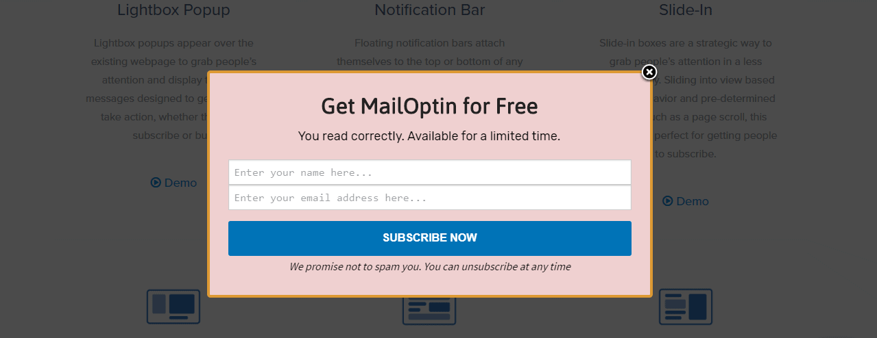
For instance, you could visit a website and see a popup similar to the one below.

Do you see that “X” in the top right-hand corner? That’s your first clue that it’s a popup. If you’re not interested in having a free MailOptin plugin, you can click the “X” and restore the page to its normal appearance.
These popups generally appear as soon as you arrive at a site — or on a time delay. As a result, they are often restricted to first-time visitors or people who have not visited in a long time.
An exit-intent popup serves the same purpose but has a different action mechanism. Instead of appearing immediately, it seems only when a user attempts to close out the browser or leave the page.
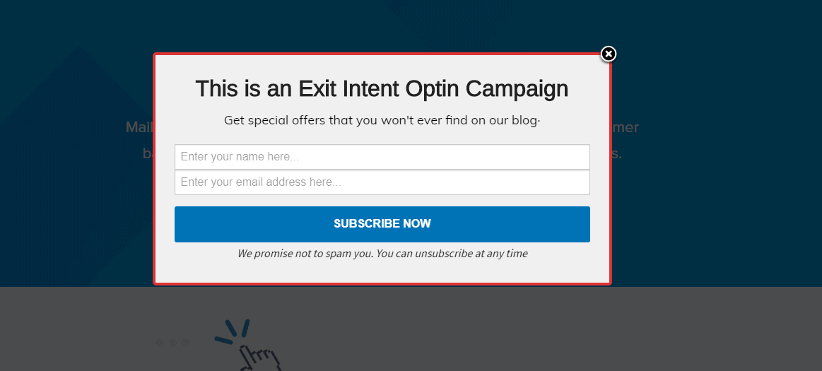
To see an example of a WordPress exit popup, visit this exit-intent page.

The popup invites me to get a special offer I won’t find on the blog. I can get that by providing my contact information.
Common Ways to Use Exit Intent Popups
Exit-Intent Popups can be used to promote multiple offers:
- Requests to participate in surveys
- Content upgrades
- Discounts and promotional codes
- Lead magnets
- Email opt-ins
You can use exit-intent popups to help you acquire or retain more customers.
However, you have to keep two things in mind:
- People access and exit a website for different reasons; and
- Some people hate popups.
You can’t do anything about the latter group. They exist. But you’ll be able to improve the popup experience to help endear prospects to your offer.
Ways to Improve Exit Intent Popup Conversion Rate
1. Offer Free Shipping on All or Certain Purchases
People like free things, and free shipping is something a lot of people want whenever they buy something online. If your store is involved in selling goods that can be shipped, it will be a good idea to offer free shipping whenever a customer abandons a cart or when they are about to leave your site.
Instead of free shipping, you may provide a discounted offer to such people to encourage them to make a purchase.
If you sell less-expensive items, consider offering free shipping as long as the shopper spends more than a certain amount.
It’s a way to overcome the shipping obstacle and encourage people to buy more products in the same transaction.
2. Create Scarcity and Urgency Behind the Offer
Probably you have heard of “impulse buys”. For example, you are standing by a shop window and see your favorite T-Shirt. It is the remaining only one on the stand. You may have yet to plan to buy the shirt at the moment; however since it is the last one, you may decide to make the purchase.
Impulse buys are made without much consideration. So are scarcity buys. You can recreate that phenomenon in an online store by incorporating scarcity or urgency into your offer on your exit popup.
For instance, you could offer a 20 percent discount on the visitor’s next order if they place it within 24 hours. If the visitor doesn’t act soon, they miss out on the discount for good.
Make sure you’re telling the truth — fake scarcity will only annoy your prospects — but use it liberally when you get the chance.
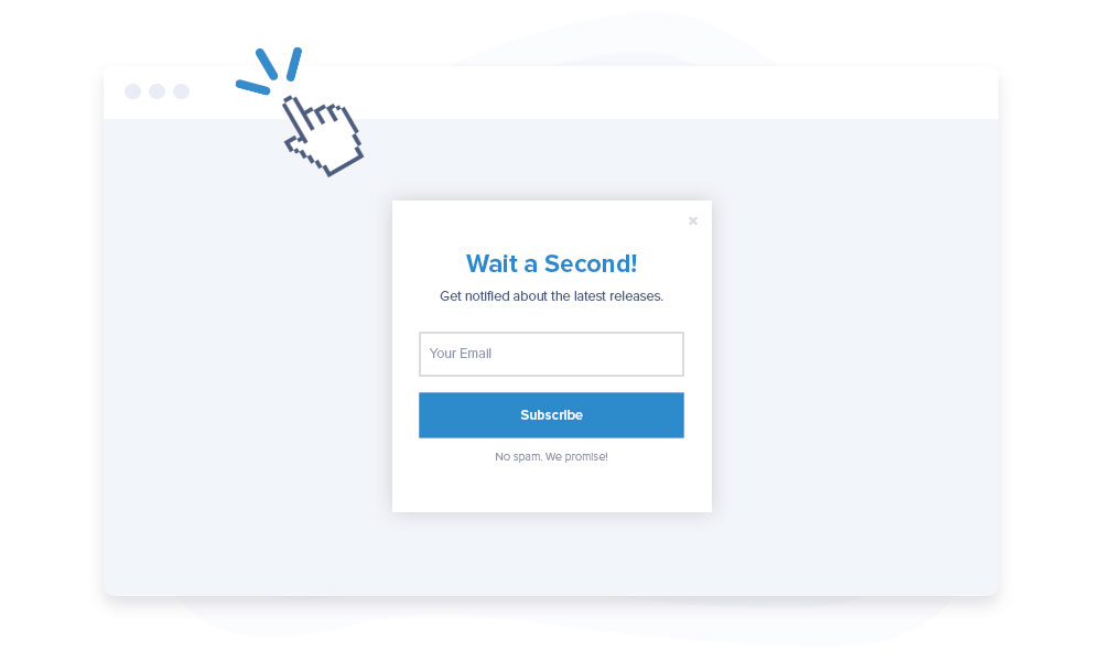
3. Use the Word “Wait” on Your Exit Popups

The word “wait” is sort of like the word “stop.” It commands attention. It is easy to grab someone’s attention when you use the word.
When you ask someone to wait, you send the subtle message that you’re about to share something they want to know. It’s psychological marketing at its finest.
Consider using that single word as your headline on the popup. Other trigger words and phrases could include stop, hold on, before you leave, hang on, or don’t miss this.
Trigger words should appear in bold, high-contrast print to ensure they’re apparent.
4. Use Humor When Appropriate
There’s nothing wrong with a bit of humor–joke here, or it is good. However, you ought to be cautious with this. It can either work for you or against you if you make a joke and no one understands. The bottom line is that you can increase or crush your conversions with a joke.
However, if you can incorporate tasteful, relevant humor into your popup, do so. It shows off your brand’s personality.
5. Incite Your Visitors’ Curiosity
Curiosity is a powerful thing. You can use it to command consumers’ attention. Once you have it, you can intriguingly present your offer. You must do it right.
If you know your audience well, you have numerous opportunities to incite curiosity, whether you lead with a fun fact or exciting statistic or present the visitor with a humorous image.
A promise can also inspire curiosity. You can help your customers achieve a specific target in their sales if you are good at that. With a promise, you can incite their curiosity.
6. Ask Your Visitors’ Opinions
Your visitors can feel involved when you ask their opinion about a decision your business is about to make. You can do that with an exit-intent popup.
You can use your exit popup to invite people to share their feedback. It could be a survey, poll, or even an email. Let your audience know you’re interested in hearing their thoughts and feelings.
People like to talk about what they think. So they love it when brands want their opinions.
7. Offer a Discount or a Free Sample
There are two words consumers love more than any other when it comes to shopping: free and discount. So, free is preferable, but we’ll take a 70-percent-off coupon code if that’s what you’re offering.
I mentioned before that exit-intent popups often work because they incentivize the visitor to return to the page and reconsider leaving. For example, if the prospect has been considering purchasing one of your products, you want to push that person toward the sale.
A discount and Free Sample are great ways to do that. You are saying, “Okay, maybe that price point scared you a bit, so let me remedy the situation.” If you sell a digital product or a service, you could offer a free sample of the product or a free consultation.
It’s not just about ingratiating yourself to your prospects. It’s about demonstrating as much value as possible. If prospects perceive value, they’ll want to buy from you.
Conclusion
Just to ensure you know, too many options will overwhelm your visitor. So keep it as simple as possible — one offer per popup.
How your popup looks can also impact conversion rates. Test elements like colors, contrast, images, and leading lines to figure out what works best.
Most of all, don’t be afraid to combine a few hacks to make your popups even more effective. Exit popups need refinement because every business’s audience is different.
What kind of exit popup are you going to create with MailOptin?
