3+ Examples of Email Signup Forms and How to Add Them
Growing the email list for your website is not easy. You need to put extra efforts and give ample time to collect leads from your website.
To seek guidance, you may take references from other websites that deal in the same niche and look at what they are doing to increase their email list.
Well, if you don’t have the time to explore the sites!
We have done this task for you by following some websites and tracking information on how they collect leads from signup forms.
Below are some email newsletter signup examples which you may consider to build an email list for your website and achieve success.
Elements to Make Your Newsletter Signup Form Great
This article contains most popular elements that you must use to create high converting email newsletter signup forms.
Ensure that you include these elements to make great email newsletter signup forms for your website.
- Include an offer or incentive – You need to make your subscribers feel that you are offering them an incentive for signups like content upgrade or any coupon.
- Tell your subscribers what do they get after Signing in – Most of the subscribers usually refrain from signing up for email newsletter because of spamming. So, it is necessary that you eliminate this fear from their mind by conveying the subscribers what exactly they will receive and what you will be sending.
- Customize your Forms according to your Post Content – The signup forms need to complement your post content. So, customize your MailOptin subscription form as per the page the visitor is reading in order to make it more personalised.
- Make use of the social proof in your signup form – Let your subscribers know how many existing subscribers you are having. It would be great if you also convey them how the email newsletter is going to benefit them!
Example Email Signup Forms Which Can Be Converted
1. Hustle Panda
Hustle Panda is a great example which can help all new companies to find suitable dot com domain.
Users may also subscribe to get new domains through their newsletters.

Things to Notice in there subscription form are:
- The message line is very clear! A user know that if he will provide his email over here! He is most likely going to get all the new .com domains.
- Email Newsletter Frequency – The line – “every few weeks” let user know how frequently he is going to receive emails from you.
2. Kate Spade
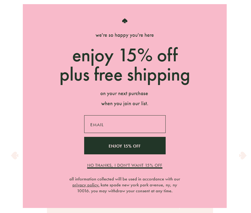
This is the exceptional signup form. It is designed mainly for e-commerce sites online.

Another great signup pop-up form which is framed to deliver coupons to each subscriber.
- Effective CTA Button – Kate Spade uses nothing previously used statements like subscribe me or sign me in! But it rather uses a strong message like – “Enjoy 15% OFF” by telling users what’s in there for them.
- A Negative Opt-out Message – Again if any user tries to exit the pop-up the negative line used – “No Thanks, I Don’t Want 15% OFF” gives a fear to user about what he is going to lose.
In order to create the signup form, you may make use of the MailOptin’s Subscriber widget along with the modal popup position.
You can also be a little smarter or creative by using the Behaviour Rules. It will be of great help to show you how soon popup shows up.
3. RemoteOK
For all remote jobs, this is the ultimate website.
In order to grow its email subscribing list RemoteOK places its signup form at the bottom of each page.

The simple design, eye-catching notification bar, and personalization option, it has all the elements that provokes user to fill in their emails.
- It also has a feature called clear frequency. This feature helps the subscriber to know how frequent subscribers would be receiving emails.
- The user can also customize the frequency right from the drop-down menu.
You would be requiring the MailOptin’s sidebar widget bar positioning in order to create a similar type of signup form for the website.
4. CopyHackers
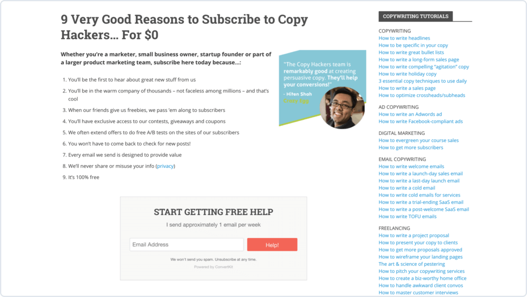
The popular copywriting blog, CopyHackers has the best and strongest email newsletter signup form page.

Things that make it great includes –
- It has a clear frequency which let the users know how many emails they would receive per day.
- Social proof in the signup form, testimonials, and examples with screenshots are some elements which are included to make the signup form really special.
You can make use of MailOptin’s Embedded/Inline optin form to place this type of subscription form between pages and posts of your website.
Final Words
Run multiple tests on your website to know which of the above works well for your site and boost your email list.
You can make use of our lead capture form plugin for WordPress to achieve all the techniques mentioned above.
Using the above-mentioned techniques, you can make the maximum conversion out of the visitors.
