7 Email Opt-in Best Practices Proven to Boost Conversion
The success of your email opt-in form is directly connected to your list building strategy. Visitors don’t waste time before they decide to either subscribe or close your email opt-in form. You have limited chances in luring visitors to subscribe to your email list and it has to happen on the first thought which depends on their impression of your offer.
Here is where the challenge lies; how do you lure your visitors to subscribe to your mailing list without hampering their user experience?
These 7 key practices will be crucial to improving your list building strategy and email ROI. They are important checklists you can easily adopt to see more email subscribers.
However, we’d advise you to be flexible and research-oriented in your list building technique because what works best for one company may need a little bit of tweaking for another company to get similar result, but these 7 best practices should act an effective framework, guiding you into a very successful list building journey.
1. Avoid too much fields on your opt-in form
Over the years, research has shown that the lesser the opt-in form fields, the higher the chances of getting subscribers. What this means is that, each field you add to your opt-ins reduces conversion by 13%.
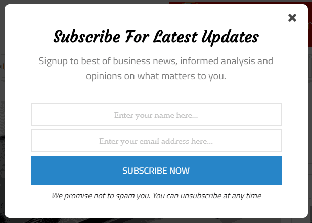
Basically, an email opt-in with two fields tend to perform better than any other combination where one field requests a visitor’s Name while the other field takes his email address.
Any visitor can easily submit that information within 30-seconds, but when a visitor discovers he has to submit a long list of information just to subscribe to a mailing list; it will be naturally off-putting, except the nature of business demands some very vital information about him.
However the case, in such situations where additional information is needed, it is best practice to maintain a two field opt-in option, then request for additional details after conversion.
In MailOptin, we have adopted the two-field email opt-in strategy by default. You can edit the fields on your dashboard. Just click “Optin Campaigns,” and locate or create an opt-in campaign, click the “Customize” button, and make modifications on the “Fields” options.
Here is what an industry standard email opt-in form looks like:

2. Provide an offer
There is a popular saying, “there is nothing free in free town” and to a large extent the statement holds true and it’s applicable in the email marketing world.
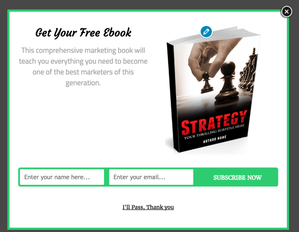
One other aggressive method to grow your list quickly is to offer an incentive. You are only saying to your visitors, “here is your free content, but you can only get it if you give me your email address.”
Smile…
This looks funny, but it works very well, every time!

Incentives to be offered could be access to free report, downloaded contents, promo codes, video series and lots more. Even online tools are golden when offering contents to your visitors.
You can take advantage of the premium “Click Link Trigger” that makes these kinds of offers easy to create and deploy to your website.
The impressive aspect of this strategy is that everyone who is interested in this offer releases a genuine email address, so conversion is very high.
Every serious email marketer must have at least one form of incentives to offer to visitors. The result can be very astonishing when properly implemented.
3. Use a maximum of 3 opt-in forms
On a page, the recommended number of email opt-in forms you should have is a maximum of three. The reason is simply to keep your site organized and maintain a good user experience rating.
Often times, after the popup has been closed by a reader, he may later find interest in your contents and wants to subscribe, he should be able to easily find an alternative email opti-in form to subscribe to.
Having a popup email opt-in form, sidebar and below post opt-in are the best industry placements, but you should also test other areas to discover what works best for you.
The point is not to bully your visitors with annoying email opt-ins everywhere in your site but also not to over respect them by hiding your opt-ins entirely. A collection of data within your site should give you a proper direction on the best approach to deploy when it comes to the numbers.
4. Never work with assumption
When we talked about getting data from within your site, you may have been wondering, “where is the data coming from?”
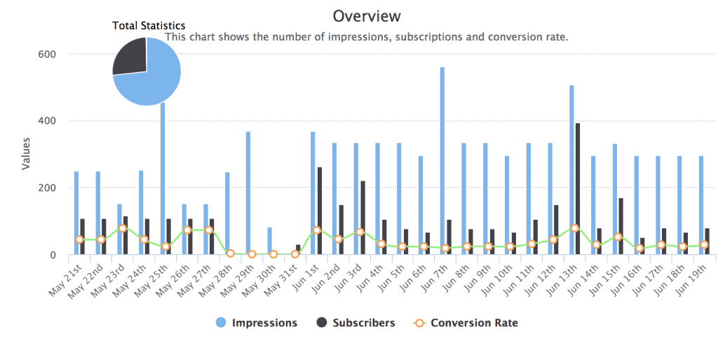
Well, these are not browser’s history or built-in traffic data. This data can only be generated from a premium software that gives you an edge in further understanding your list building journey. Some premium software solution may force you into downloading a third party application to get your email opt-in metrics.
The approach is very different here; we have our opt-in analytics built-in. From the day you install and activate MailOptin, you start collecting data which is really helpful in making the right decision for building your email list.

Never work with assumptions, run from any program or software that doesn’t provide a holistic metrics for determining the progress of your email opt-in forms. Assumption is the lowest form of ignorance, but there is power in knowing which can only be accessed via data.
5. Say something more enticing than “newsletter”
Don’t bring that boring and over-flogged “newsletter” tag to your email marketing. People have gotten too used to the tag; it is not enticing in any way and will hamper your click through rate.
Make your readers eager to open your newsletters. Successful bloggers like Copyblogger use the word “updates” rather than “newsletter,” you can come up with something that doesn’t make you look orthodox.
“The Buzz,” Anyone?
6. Adopt social proof
Social proof is simply bragging about your subscriber base. These are imaginary numbers that does the trick of luring people to subscribe to your mailing list.
Now compare these statements:
“Join over 32,000 of your peers and get daily offers” and “Join over 32 of your peers and get daily offers.”
You certainly don’t need rocket science to determine which one sells best. The former is more likely to draw the attention of users than the uninspiring latter.
So, don’t be scared to manipulate the numbers, the numbers only helps in triggering conversion but don’t get carried away with the false social proof, your genuine subscriber count will always be visible in your email service provider dashboard.
7. Always use a form, avoid link
It is best practice to avoid using a link to ask for subscribers. It is a very poor form of email marketing and has never been effective.
Rather than taking up more space in your site with the “subscribe” link, why not make use of a form? An opt-in form makes it super easy to subscribe within the site and can contain vital information capable of luring stubborn visitors but a mere link has nothing to offer and the fact that it has to take a visitor to another page before he can subscribe is a complete no brainer.
Bonus:
- Consider changing the “subscribe” on the opt-in form button to something eye grabbing. For example, “join us,” “get special offer,” “become a legend” and lots more.
- Don’t forget to give subscribers an option to unsubscribe.
- Use a default email in the email field looking like this, [email protected].
- Blend your email-optin form with your site’s existing design.
- Avoid spamming your subscribers with irreverent mails, make use of segmented list to send targeted emails.
Final Thoughts
These are some of the best practices that will give you unfair advantage in your list building journey. Remember not to limit yourself to what we have here, but to build on it and test and much as you can until you get your desired result.
This post was written by Nick Stephens, a freelance writer specializing in digital marketing. He is a massive geek when it comes to learning how to drive business online. And loves crafting word magic. Check out more of his work at njstephens.com.
