10 Ways to Optimize Your Email Optin Forms for Better Results
Email marketing has become an important part of marketing for any business. A survey by Litmus buttresses this, where customers ranked emailing as the most relevant marketing channel for the next 10 years.
Email marketing begins from capturing leads and converting them to paying customers. The most important, in this chain is capturing the lead. Hence, the more lead you get, the more likely you are to have increased conversion.
To capture a lead, you must have an email opt-in form that convinces people that visit your website that they should provide their emails to you in exchange for something relevant to them.
The tips below shows how you can make your email signup forms capture (more) leads.
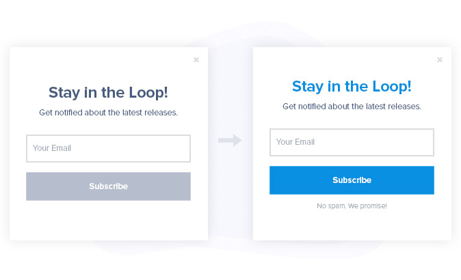
Use Fewer Form Fields
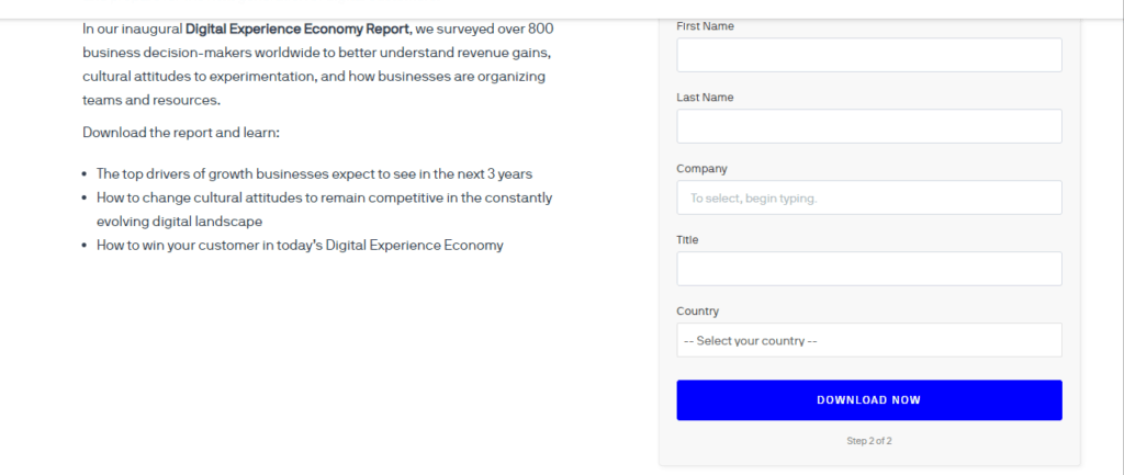
With so much buzz about data privacy and so many things calling for users attention, the number one turn-off is too many form fields. Keep your form fields within 4 to 3, that is if you must collect more information. For best results you should only have one field. This indicate to a potential subscriber that they won’t be spending so much time filling out your form.
Make Your Exit Button Clearly Visible
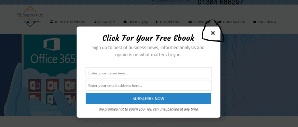
Having an inconspicuous close button can be very annoying to visitors. Ensure that you make your exit button clear enough on your pop-up forms so that users can keep looking through your website, if they are not interested in the pop-up.
Not making your exit button visible can result in a high bounce rate as visitors would quickly leave if they are not interested in your offering. Hence you lose the opportunity to present them with other offers. You can always remind them of the same offering or another related offering using MailOptin suite of features such as a slide-in or an exit intent offer.
Use Power Words
Power words are those keywords that get the best of every customer’s curiosity, greed and desire. They spur them to want the information you have to offer immediately. Examples of power words are “Double”, “last-minute freebie”, “Multiply”, “Trade-Secrets”. There are so many of these words and you can incorporate them into your opt-in copy, to get your visitors excited.
An Optimizely survey showed that Teespring saw a 12.7% increase in conversion when they used the right power words on their forms. Instead of saying sign up for our weekly newsletter, you could say get current marketing trends or trade secrets in your mailbox.
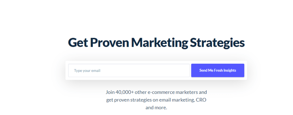
Be Specific About Your Offering
Be clear about what intending subscribers should be expecting in their email box. Don’t only say “Get a Free Ebook on Marketing” when you can tell them the juicy details in the book. For example: “20 Ways to Make Money in 2019”.
Use Social Proof
With different products in the market, customers always want validity and proof. Hence, why should they use your product or sign up for your service? The best way to show this is social proof. This can be in the form of a testimonial, the number of downloads, the number of great reviews, recommendations or number of sign ups.
A study by harvard business school showed that an added star on a yelp rating can lead to over 9% increase in sales for any business. Since there is only a limited space on your optin form. A figure that shows how many people have signed up for your training or how many have gotten a particular benefit from your training can go a long way to convincing your visitor.
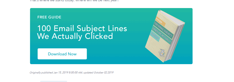
Provide a Sneak Peek
People are receiving so much irrelevant emails. How can you convince them that your message or whatever you are sending to their email box would meet up to your promise. You can add a link to your form or add an image that shows a sneak peek into your newsletter or the ebook you are about to send to them or testimonials of people who have used the material. This can boost their confidence and make them sign up.
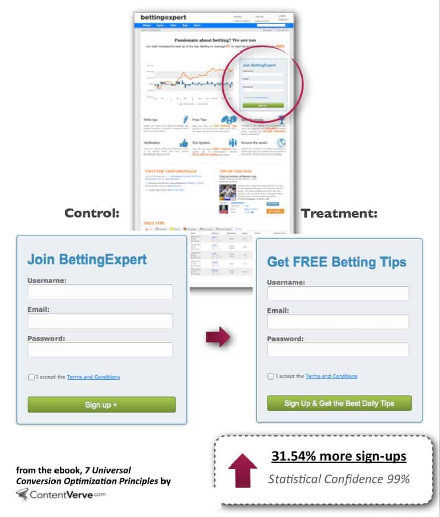
Get Creative With Your CTA
Yes, call to actions can make a huge difference in whether or not visitors submit their details in your form. Being more specific on your CTA will earn you more leads than when you are generic. This was proven when ContentVerve carried out a Split test for Betting Expert after changing their CTA.
Get Personal

People are more likely to interact with your form when they can attach a face to your information. This is why webinars and live videos will mostly get more signups than giving out a free ebook. To get the best of the psychology behind this, you can use copy words like “join me in a 10 days free lecture” or “ Hi, I am Jeff, I will be sending you my extensive guide on marketing. ”
Use Designs that Blend or Stand Out
Using colors that blend with your website theme, provides less distraction and keeps the customer at home with your website. Using colors that also standout, can draw the attention of your visitors. However making your form too colorful can repel signups or make your website seen too busy and you might lose a potential lead.
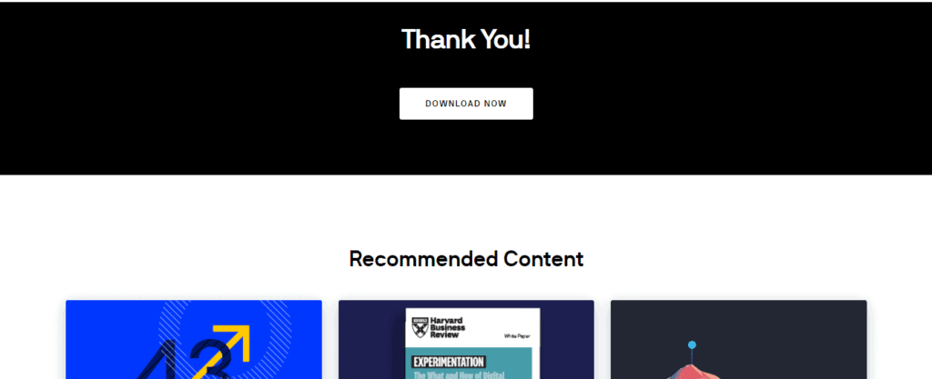
Use Thank You Pages
Thank you pages are a great way to show visitors more related content that have a high potential of attracting them to signup for other content or services . Chances are if they were interested in the information they just signed up for, they would be interested in the related information that would appear on your thank you page.
It can be as follows.
Test, Test, Test
While these tips work every time and across most niche, to understand what has worked best for your visitors and if you should keep using it, you should carry out an A/B test. You can try using two power words on different forms and see the one that attracts more leads.
Wrapping up
The success of your optin campaigns depend on your forms. If your forms are not optimized, they won’t attract leads. Even when they attract visitors or users of your website, they likely will not subscribe. Use the tips mentioned in this article to improve and optimize your optin forms for increase in conversion.