How to Create Newsletter Landing Pages with WordPress
Getting your first thousand subscribers when you have just started your newsletter can be hard. It can be even harder if you don’t have a landing page where you can send people to subscribe.
But having a basic landing page is only half the solution. First, you need a landing page that makes visitors want to subscribe.
In this article, I will show you what makes a good landing page, how to make your copy irresistible, and finally, how to create a landing page using WordPress.
What a Good Newsletter Landing Page Looks Like
Before we create your newsletter landing page, let me show you a couple of examples of what a good one looks like.
First off, you don’t need a fancy design.
A simple landing page that clearly describes what your newsletter is all about is all you need.
Don’t believe me?
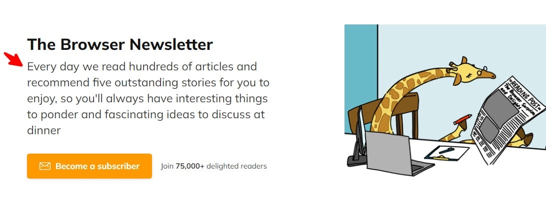
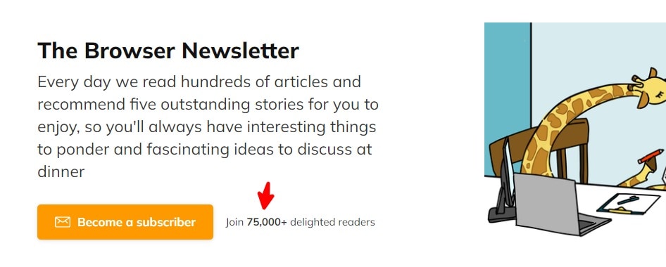
The Browser is a popular newsletter that curates the best articles on the internet. They have 75,000+ subscribers, and this is how basic their landing page is:
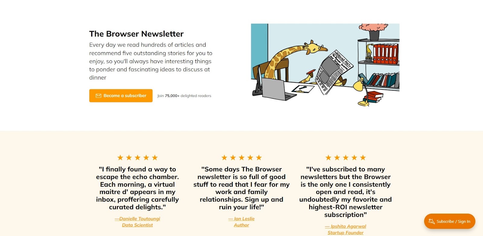
See how clean this landing page is. It doesn’t even have a logo or a navigation menu on top.
Also, notice how simple their copy is:
Their landing page describes in simple words what their newsletter is all about. But, unfortunately, it doesn’t talk about much else.
A simple landing page with a clear copy describing your newsletter is all you need.
Here’s another example of what a good newsletter landing page looks like:
See how simple it is?
It has a logo, a simple copy that describes the newsletter, and a signup form. And that’s all you see when you open that page.
If you scroll down a little, you will see some testimonials from their subscribers and then another signup form right after that:
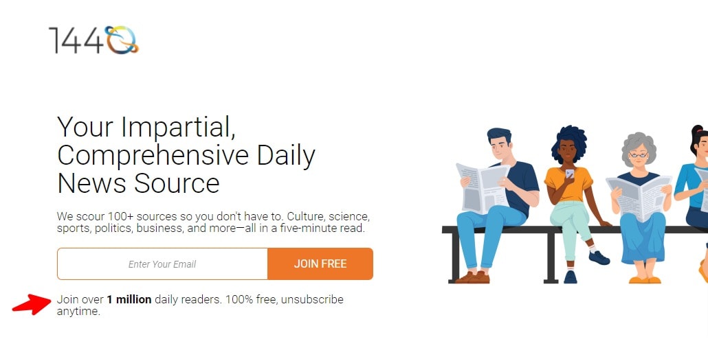
The reason why most newsletters use a simple, basic design is that it works! For example, 1440 has over 1 million subscribers.
If these three super-successful newsletters can reach millions of readers with a basic landing page, you don’t need a fancy landing page either. The simpler your landing page, the better.
Make Your Copy Irresistible
Your landing page’s copy determines whether people subscribe to your newsletter or ignore it. A good landing page grabs the reader’s attention and convinces them to subscribe. Here are some tips to make your landing page copy irresistible:
Use a Simple Headline That Clearly Explains What Your Newsletter Is About
Your headline’s job is to grab the reader’s attention.
If your headline sucks, no one will read the rest of your copy. That means, no one will subscribe.
You don’t need to be a pro copywriter to develop a good headline. And no, it doesn’t need to be groundbreaking or clickbaity!
It needs to explain why your newsletter is worth subscribing to in simple words.
Here’s an example of what this looks like:

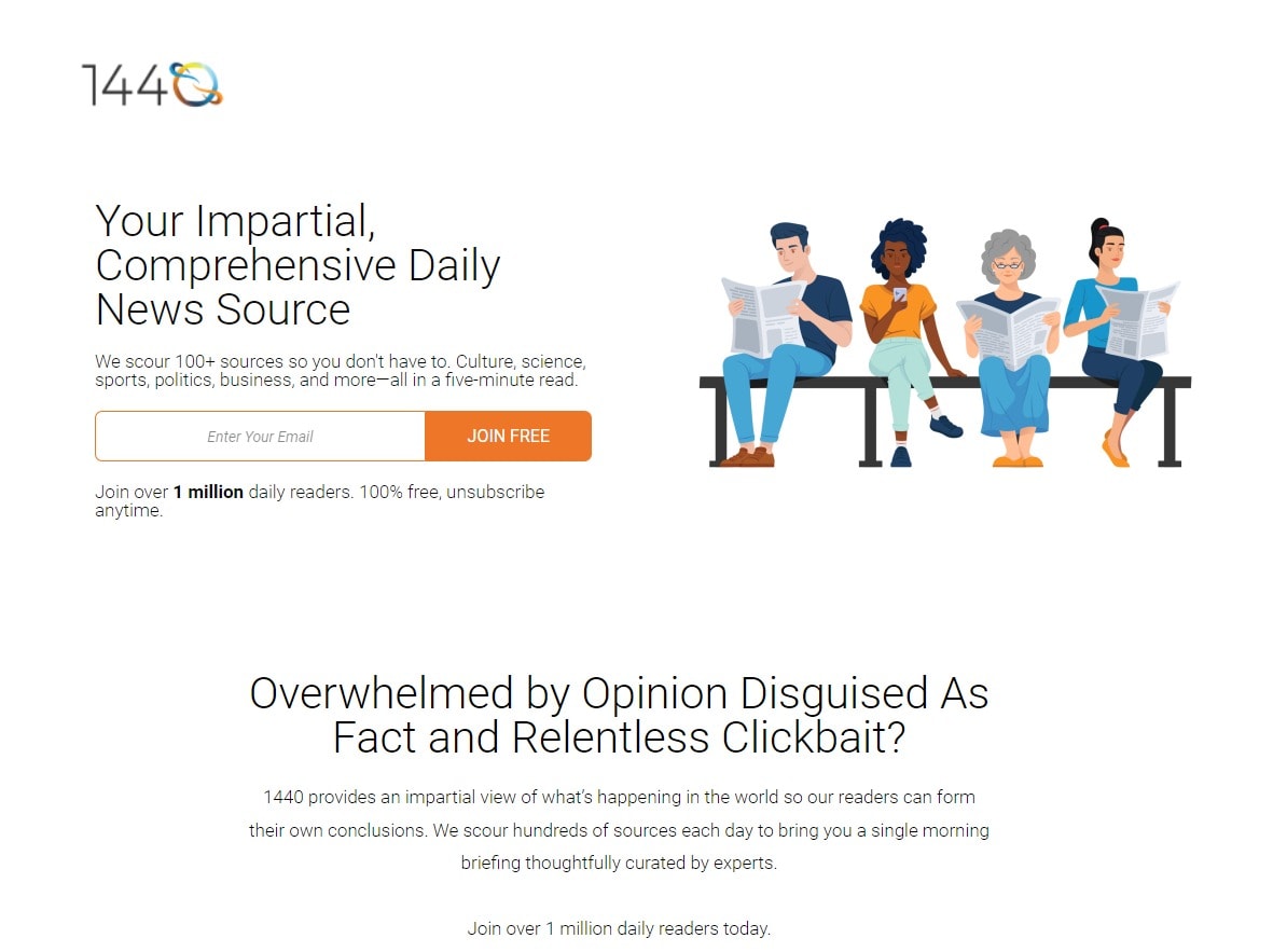
1440 is a newsletter that curates the best news from the internet and summarizes it. Their headline is simple and clearly explains what they do and why it makes sense to subscribe to their newsletter.
Here’s another great example from The Daily Upside:

The Daily Upside differentiates itself from other news-related newsletters using a simple headline. However, they offer you more than just some basic financial news; they offer insight!
If you can’t think of a good headline, try using a testimonial-based headline. For example, have any fans said anything good about your newsletter? Then, you can use that as a headline.
Here’s an example of a testimonial-based headline: “My productivity went through the roof ever since I joined this newsletter!”
Here’s another example of what this would look like for a weight-loss-related newsletter: “I have already lost 10 pounds since I joined this newsletter two months ago.”
Make An Offer They Can’t Refuse
Right after your headline, you need to make a case for why people should join your newsletter.
What’s so special about it?
What differentiates your newsletter from the thousands of others?
Answering these questions might help you develop an apt description for your newsletter.
Almost every newsletter that has millions of subscribers does this. So even if your headline is enticing, you still need to explain your newsletter in more detail.
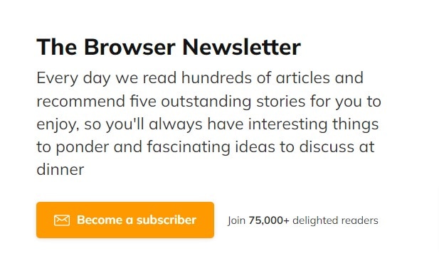
The Browser’s landing page offers a perfect example of this:
They describe their newsletter in simple words. They read hundreds of articles and recommend you the best five every day. They also make a case for why you should join: “…so you’ll always have interesting things to ponder and fascinating ideas to discuss at dinner.”
The Daily Upside offers a great example of how to keep it simple but enticing:
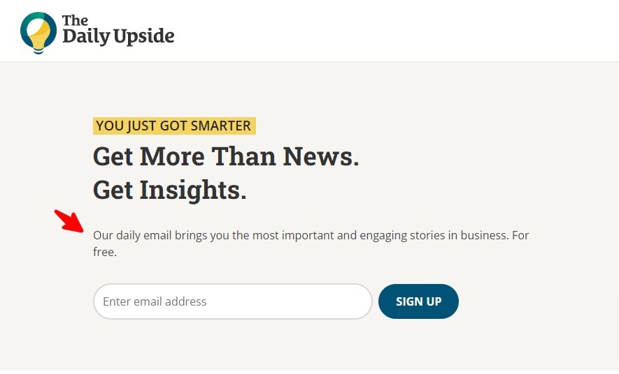
Get a free daily email with the most important and engaging stories in business. They couldn’t have described their newsletter in simpler words had they tried.
One thing to learn from The Daily Upside is that their copy makes the reader feel they are missing out on something important to them if they don’t join right now!
Remove All Distractions
Anything and everything that isn’t your newsletter’s sign-up form is a distraction. So it would be best if you got rid of everything you can, save for your logo and the sign-up form. This means no sidebar, no ads, and, if possible, no navigation menu.
The homepage of Neville Medhora’s Copywriting Course blog is a great example of this:
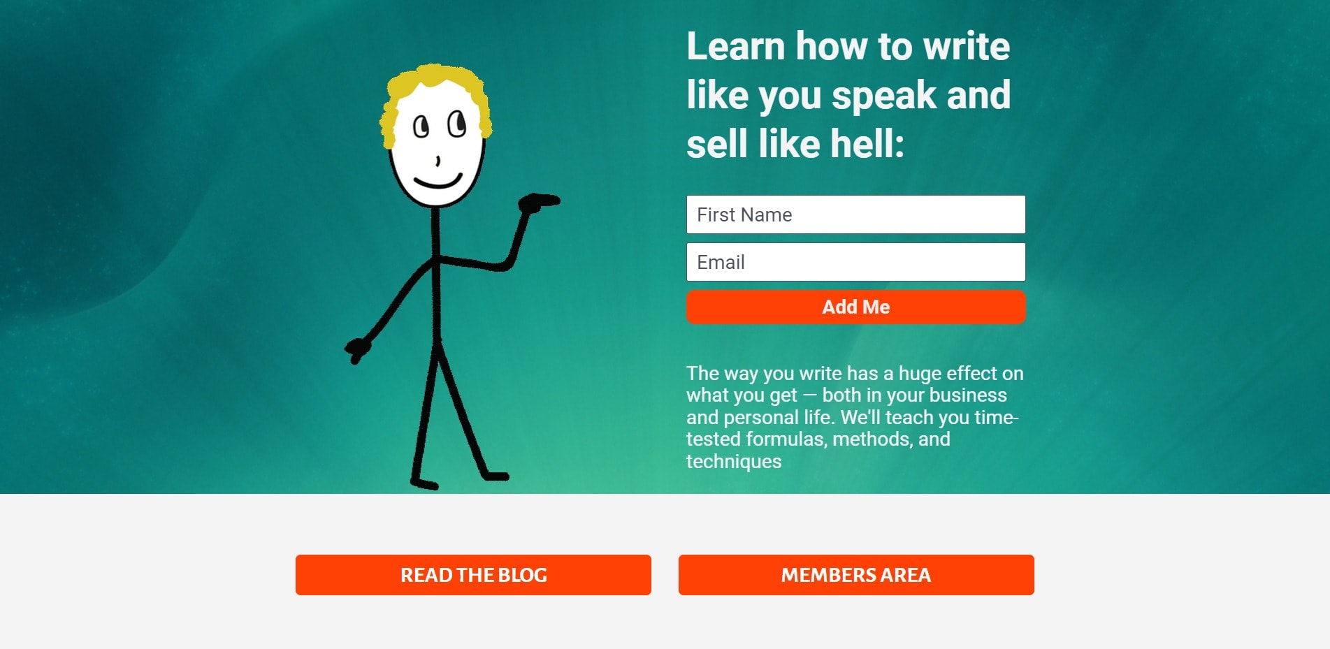
See how the sign-up form takes up most of the page?
This is Neville’s homepage! There are no distractions on this page. There is no way for the reader to avoid the signup form.
The only two other links on the page are a link to Neville’s blog and his course’s members area. If this weren’t his homepage and were a standalone landing page, he wouldn’t have put any links on it.
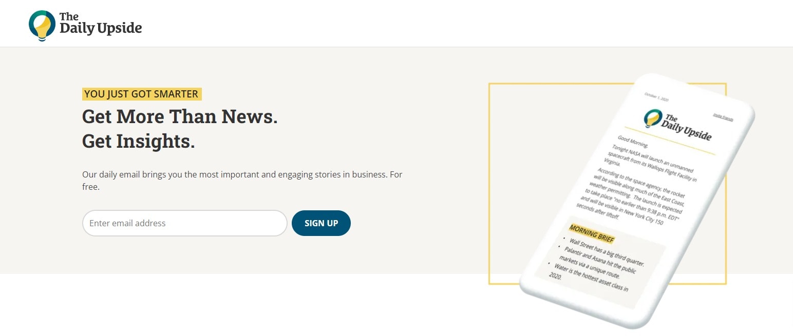
The Daily Upside does the same thing. Only a logo and no navigation bar or anything else that could distract the visitor.
The cleaner your landing page, the more the people will subscribe. Don’t confuse your readers with lots of links and buttons.
Use Social Proof
Humans love social proof! If we know that many other people are doing something, then our brains automatically think that that thing must be good.
This is why you see those buyer notifications on all eCommerce sites that tell you someone just bought the product you are looking at.
A lot of popular newsletters do it, including The Browser:
… and 1440, a newsletter with over 1 million subscribers:
Backlinko also uses social proof on their newsletter sign up landing page:
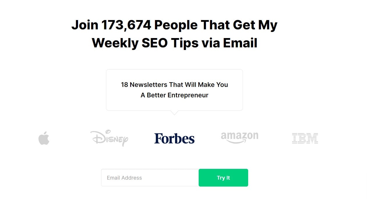
Backlinko not only tells you how many people (marketers) are already on their email list, but they also tell you that their readers (who are marketing professionals) work at big brands such as Disney and Apple.
Even if you have never heard of Backlinko as a marketer, you might consider signing up to see how many people have already subscribed.
So if you already have thousands of subscribers, let your readers know. It can be as simple as writing “Join 25,000 other fitness enthusiasts!” at the bottom of your sign-up form. But keep in mind that if you have less than a thousand subscribers, it can backfire!
Use Benefit-Based Submit Button Copy
Most sign-up buttons use some boring text such as “Sign Up” or “Submit.”
That’s a missed opportunity!
You can use your sign-up button to reiterate the benefit your reader will gain from signing up.
If your newsletter is about weight loss, you might want to use something like “Sign Me Up For Internet’s Best Weight Loss Tips!” for your sign-up button. This reiterates the benefit your reader stands to gain from signing up.
If your newsletter is about the latest marketing news, use something like “Make Me a Smarter Marketer!”
Got Any Good Testimonials?
… then this is the time to show them.
Testimonials from your readers or industry influencers make you look like an expert. Testimonials are proof that your content is good.
Here’s an example from Backlinko’s homepage:
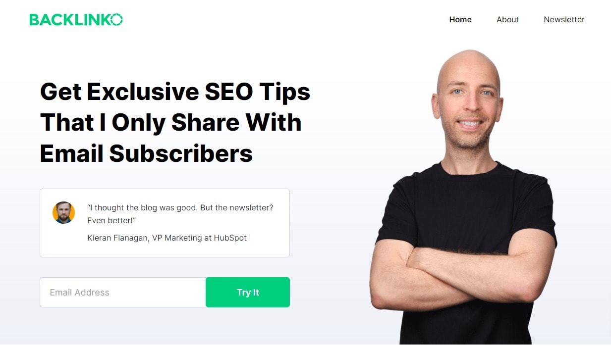
Notice how he uses a testimonial from an industry influencer?
Having a testimonial from a well-known and respected industry influencer can help double the perceived value of your newsletter.
The browser does it too:
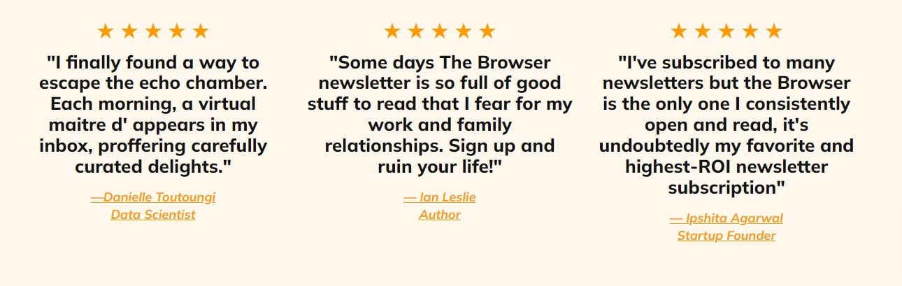
Their homepage shows testimonials from a data scientist, a book author, and a startup founder.
If you don’t have testimonials from industry influencers, you can use a testimonial from any fan mail you might have received from your newsletter subscribers.
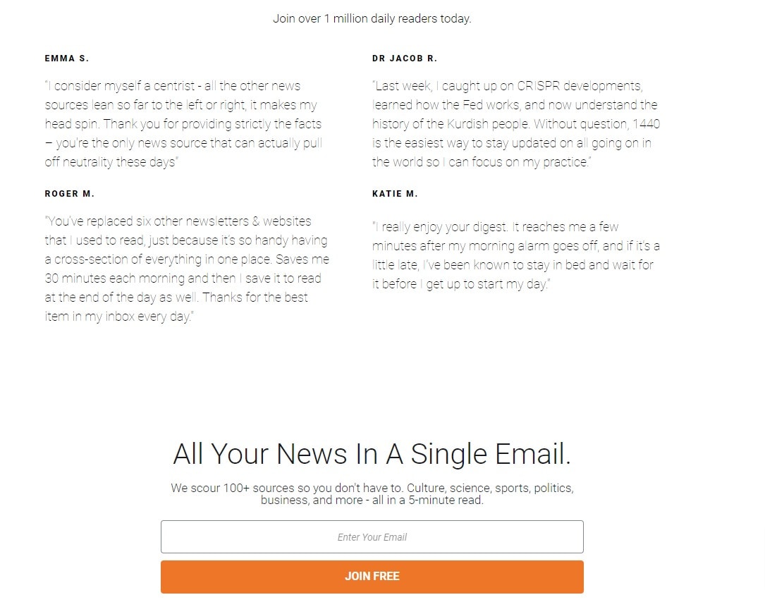
This is what 1440 does on their landing page:
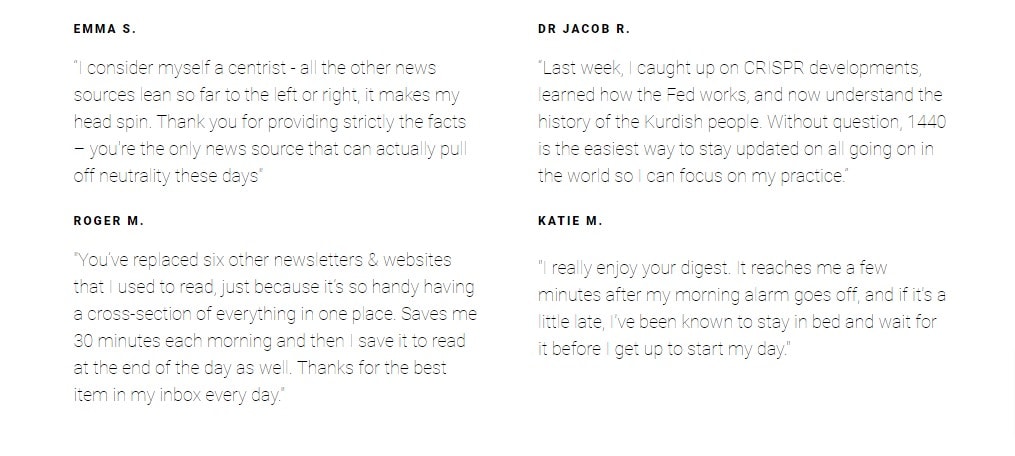
These four testimonials are from their regular readers.
If you have any good testimonials, use them on your landing page.
How To Create Your Landing Page
To create the landing page for our newsletter, we will be using MailOptin. It is an all-in-one email marketing tool for WordPress that helps you skyrocket your revenue. In addition, it comes with easy tools for creating eye-catching, high-converting opt-in forms.
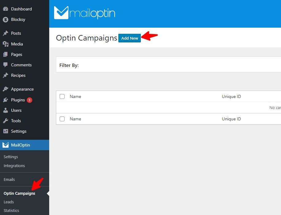
To create your newsletter landing page, we need to create the opt-in form.
To do this, login to WordPress and go to the Campaigns page of MailOptin and click the Add New button:
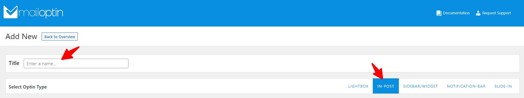
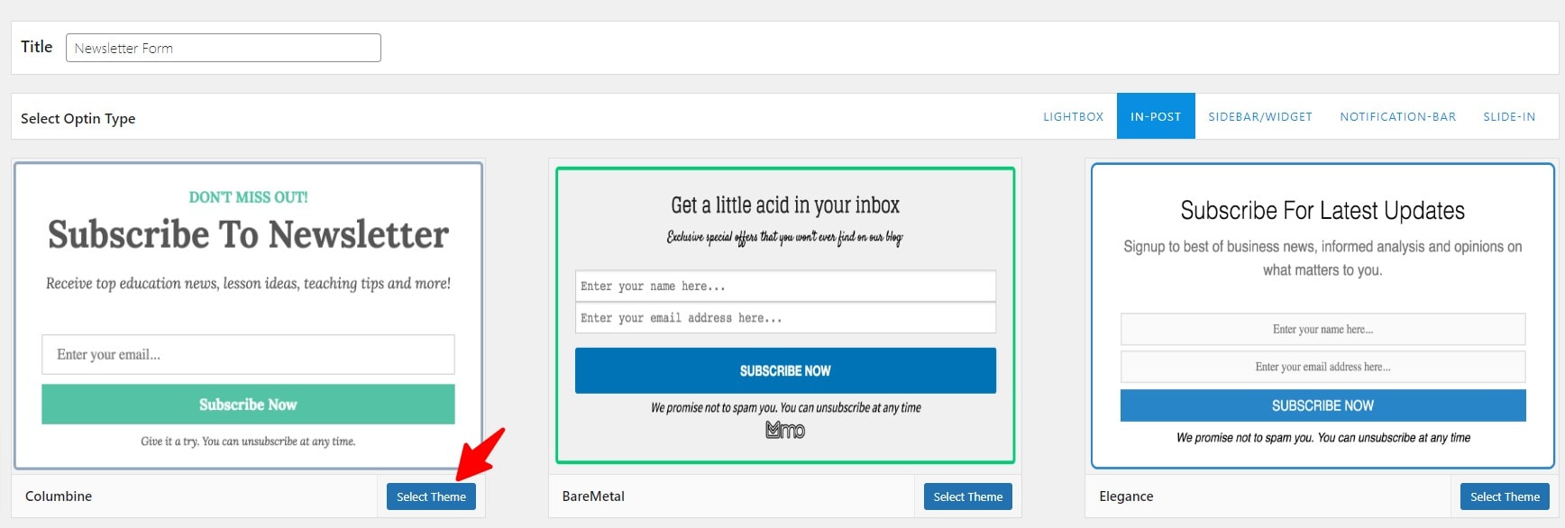
Now, enter a name for your new opt-in form and select in-post for Optin Type:
Now, select a template that you like. I will select the first one for this example:
Once you select a template, you will be taken to the opt-in form customization page. Click anything in the form to edit it.
If you click the title of the form, you will be able to edit it:
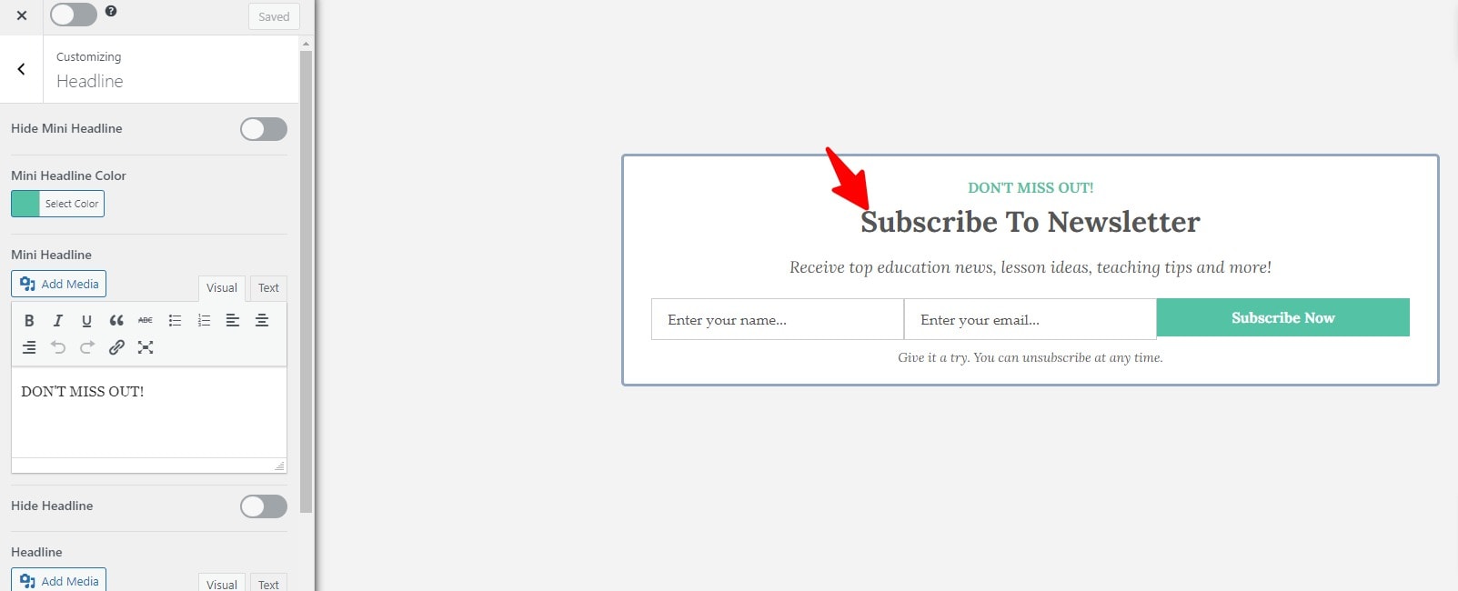
You can customize your form to match the style of your website. Read the previous section on making your offer irresistible to get some ideas to improve your copy.
Once you are done customizing the form, you will need to make a couple of changes to the settings of this form.
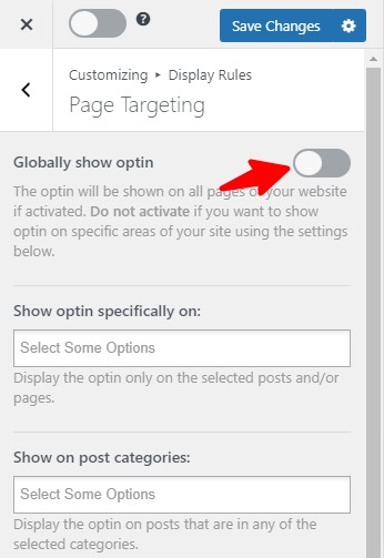
First, from the customization sidebar, go to Display Rules -> Page Targeting. Then disable the Global show optin option and click the Save Changes button on top:
Now, click the back button twice to go back. Then select Integrations. In this section, you can integrate this form with your Email Marketing Platform (such as Mailchimp). But for now, if you don’t have an integration already set up, let’s select MailOptin Leads Only and click Save Changes:
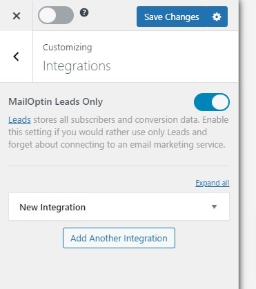
Later, you can export these leads and import them into your email marketing platform.
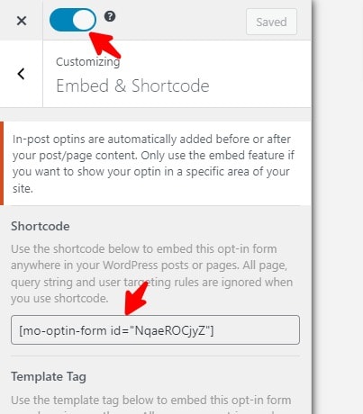
Now, go back and select the Embed & Shortcode section. Then copy the Shortcode that you see on that page and click the enable button on the top left:
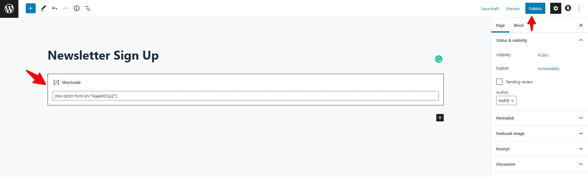
Now that we have created the opt-in form let’s create the page where it will be displayed.
It’s straightforward. Just create a new page from your WordPress Dashboard and paste the shortcode you just copied, and then click the Publish button:
This will create a new landing page for your newsletter that you can add to your navigation bar and share on social media:
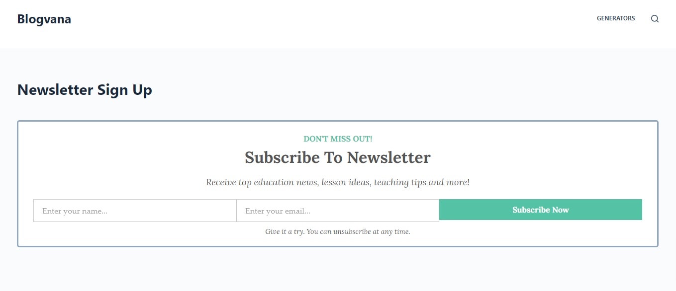
How your landing page ends up looking will depend upon your theme. Some themes let you disable the sidebar and use a wide layout for your pages, as you can see in the example above. Some themes let you disable the navigation bar for specific pages, which you might want to do for your landing page.
Now that your newsletter landing page is ready, it’s time to share it on social media and add it to your navigation menu.
Conclusion
Creating a basic landing page for your newsletter is important. It lets you promote your newsletter anywhere you want on the internet. If you haven’t already created one, what are you waiting for? It only takes a couple of minutes.