How to Effectively Use Exit-Intent Popups in WordPress To Skyrocket Conversion Rates
What if there were one simple way for your site to convert 100x the people you currently are?
Something that works on every website can be set up in a matter of minutes (with the help of MailOptin), works forever, and will help you build your email list for years to come. Yep, you might’ve guessed – we’re talking about exit-intent popups.
Exit-intent popups are the perfect way to:
- Reduce shopping cart abandonment
- Grow your email list (faster than ever)
- Capture leads before people bounce
Put it this way: You spend all this money marketing your website, brand, products, and services—someone lands on your site. The chances are that not every single one of those amazing people who land on your site will convert right away.
Without exit-intent popups, most people leave your site without taking any action. Fortunately, this is something you can change—and is entirely in your control—so, without further ado, let’s examine how to use exit-intent popups to engage visitors on your website.
What Are Exit Intent Popups?
Like a good salesperson at a shop you are about to leave, exit-intent popups are tempting offers or calls to action that appear just as you’re about to leave the page. Using mouse-tracking technology that determines when someone is about to navigate away from your website, MailOptin can trigger a popup that may feature various things, including an opt-in form or call to action (CTA) that leads to a landing page.
Attracting traffic to your website requires time and money—lots of it. So, the last thing you want is to let people go without trying your best to convert them into customers.
Exit popups appear just when your cursor moves toward the X in the corner of the screen. Because they track cursor movement, you know that the user is going to read your message.
If you frequently surf the website, you have probably seen quite a few exit-intent popups. Here’s an example:

This full-screen popup appears on Xero’s website and has a running timer. This is designed to invoke a sense of urgency in the visitor, offering a $100 gift certificate. The popup doesn’t appear for all users either; it only shows up if you have something in your cart.
This is Xero’s way of reducing its shopping cart abandonment rate. Creating exit-intent popups on your website is a great idea if you want to generate leads. However, you need to be careful about where you add popups to your site.
Simply putting exit-intent popups on every page is a terrible idea and will result in a significant drop in traffic. You need to create a comprehensive strategy for the kind of user you want to engage with so that the offer, messaging, and timing catch them in the perfect moment and present something that’s going to take them closer to taking the action you want them to take.
For instance, if an exit-intent popup shows up for all users, even ones who haven’t interacted with your site in any way, it might cause a higher proportion of visitors to leave immediately – this is called the bounce rate. Tracking your website’s bounce rate is important, and properly placed exit popups can help to bring it down considerably. According to GoRocketfuel.com, the average bounce rate is between 26% and 70%.
If your bounce rate is already very high, taking advantage of exit-intent popups is a very good way to get this under control—and at least capture the visitors who are in your demographic and interested in what you have to offer when they’re on your website.
The Most Popular Exit-Intent Popup Strategies
A common mistake that many marketers make is that they cram their exit-intent popups with lots of content. That’s a terrible idea. Remember, your exit-intent popups should serve a singular purpose. Avoid adding multiple CTAs or giving users a choice, and use the KISS strategy when creating a popup.
Research shows that the human attention span is between 6-8 seconds. That’s the amount of time you have to turn a visitor around. So, if you are going to create an exit-intent popup, it should really grab their attention. Here are a few strategies that you can try.
Coupon Codes
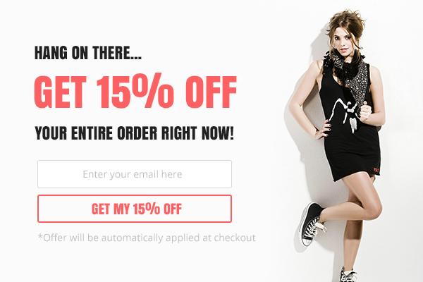
Coupon codes are a time-tested strategy for urging customers to complete their purchases. If a user had something in their shopping cart and was browsing your page for a while before they decided to leave, you can sweeten the deal by giving them a further discount.
In return for the discount, you can get their email address, which can help in boosting your newsletter audience. These exit overlay popups are best used on product pages or when you know that the user is about to abandon their cart.
You can also offer coupon codes for running discounts on your platform or for a user’s next purchase. Here’s an example from Leesa, a mattress manufacturer:
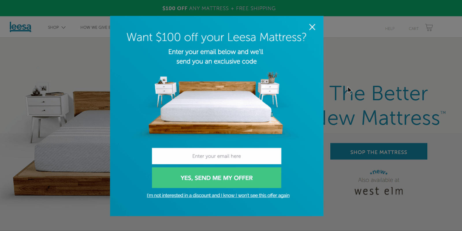
These guys offer a $100 discount code in exchange for your contact info. It’s decent compared to the average product price on their website, but to dissuade customers, they have a pretty lengthy message at the bottom written in the first person with negative connotations.
You could also offer users free shipping by incentivizing them with a code that removes shipping costs from their orders.
Offer a Lead Magnet
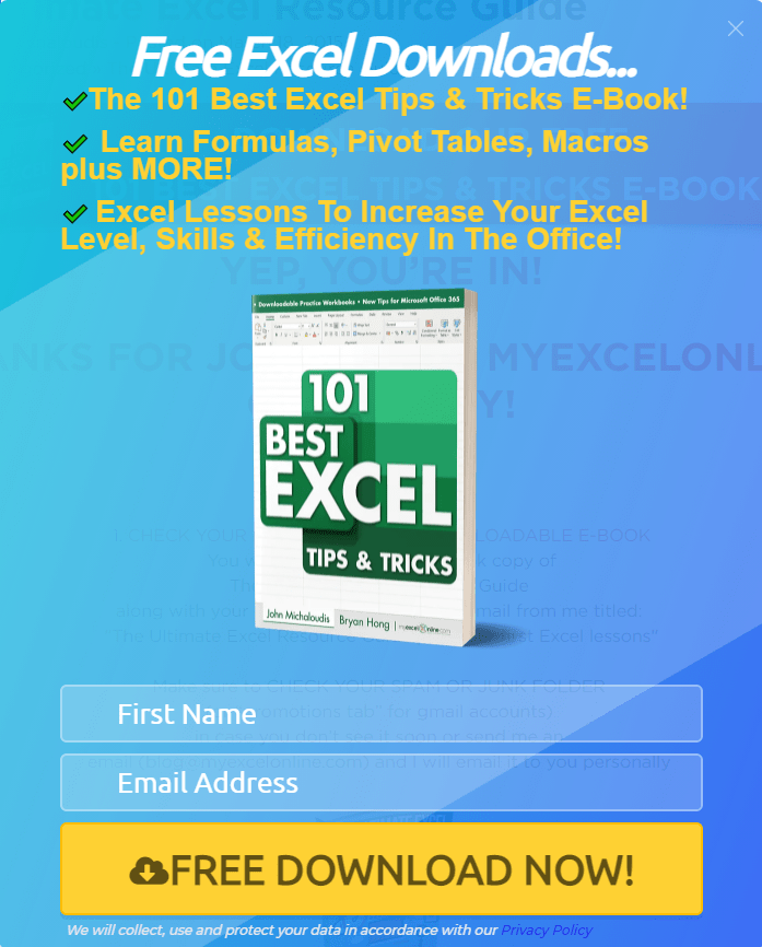
Lead magnets are free items, services, or incentives that you can offer to users in exchange for their contact information. As you can see above, the lead magnet on offer is an eBook that gives tips and tricks about Microsoft Excel. Instead of cluttering up space, they added a virtual front cover for the book and three main points to convince the user.
This is a great strategy for converting users who are about to close your landing page. It gives them a free offer relevant to what they have been searching for, and giveaways are a goodwill gesture that can increase the possibility of a future sale.
You could always offer something else instead of an eBook, such as a course.
Ask Them to Join Your Newsletter
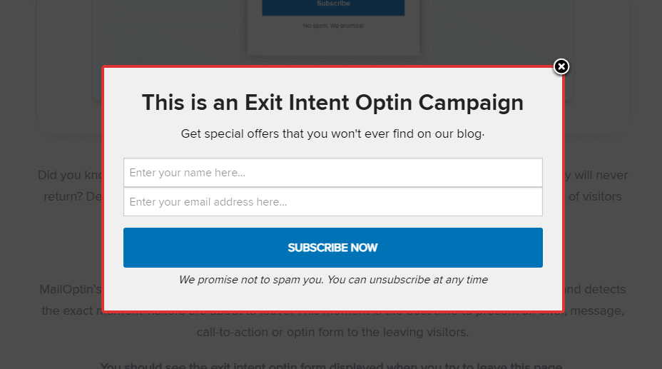
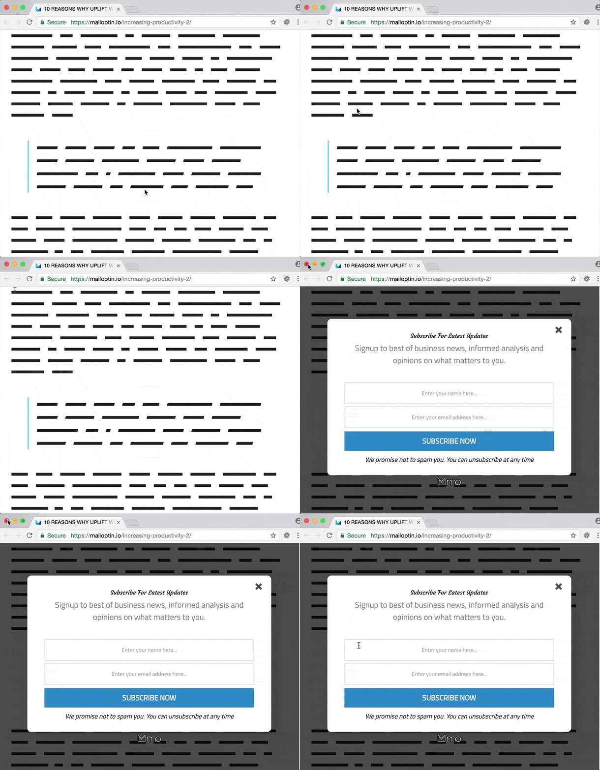
What value does your newsletter offer to the reader? This exit-intent popup from MailOptin keeps it simple. In exchange for a user’s name and email address, it promises “special offers that you can’t ever find on their blog.”
To provide assurance, they use conversational language at the bottom, letting a user know that they can unsubscribe whenever they like and don’t have to worry about spam.
The popup is designed to minimize the trade-off in the user’s head. In return for their contact information, they get access to exclusive deals. Plus, they can always choose not to receive more offers.
You can create exit-intent popups for any number of things. Here are a few other strategies:
- Free demo: Using a third-party tool like Calendly, you can easily offer users the chance to schedule a demo at a date and time of their choosing.
- Lucky draws: You can ask for their contact details in exchange for adding them to a lucky draw or raffle. Make sure the prize is interesting enough for this strategy to work!
- Free reward: Offer users a free reward sent to their email. It could be an eBook, a course, or a coupon code. By not telling users what it is, you can generate intrigue and interest.
- Ask for a donation: Not-for-profit organizations usually deploy these exit-intent popups. They mainly include thought-provoking photos designed to invoke sympathy and convince a user to donate to their cause.
In terms of setup, there are different types of opt-in form display options that can be found in a tool. Exit intent popup is just one of them which works particularly well.
- Standard lightbox popup – this is the type that displays over a web page immediately after the page loads fully or within some specified duration of time. Below the proceeding paragraphs, you’ll find the benefit of using time on site as a display rule or trigger
- SideBar Widget—This is mostly familiar to experienced WordPress users. With it, you display your opt-in form in a sidebar widget.
- Slide In – a form automatically slides in from the right, left, top, or bottom of the page you visit. That’s how this one works.
- Notification bar – either at the top or bottom, you use this one to get the attention of website visitors in order to offer them something of value
- Inline form – you can embed this type within your blog posts either as one step or two-step opt-in offer
- Before/After Post— You decide to display this one visibly before or after the blog post on your site. Like many others, you can test your lead generation ideas to find out which one converts more.
How to Add Exit Intent Popups to Your WordPress Site
If you have a WordPress site, you can easily add exit-intent popups using a plugin like MailOptin. MailOptin is ideal for lead generation and email automation and can help with business growth. Here’s a step-by-step guide for adding exit-intent popups using MailOptin to your WP site.
Step 1: Download and Install MailOptin
Firstly, you will need to download and install MailOptin on your WordPress site. Once you have installed the plugin, enter your licensing information to activate it.
Step 2: Connect to Your Preferred Email Provider
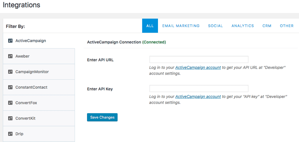
MailOptin seamlessly integrates with many email marketing providers, including Mailchimp, AWeber, Campaign Monitor, and many others. You can view the Integrations through your WP dashboard. Go to MailOptin > Integrations.
MailOptin will provide all the necessary steps to establish a connection with your email management service. This includes taking you to a link where you can get your API Keys.
Step 3: Launch a Campaign
Go to MailOptin from your WordPress dashboard, and then select Add New under Optin Campaign. You will get a prompt to enter the name of your campaign and select an optin form type. Since you will be working with exit intent, you have to select the “Lightbox” optin type.
There are several templates that you can choose from, as shown below:
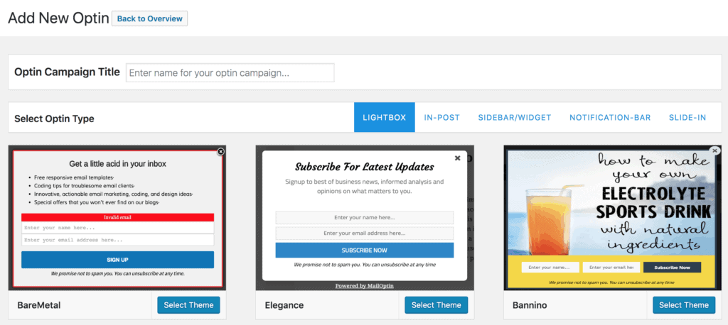
Once you select a template, you can customize it according to your marketing needs. You can also add animation effects to your exit intent popups.
When you’re done, head over to “Display Rules” in the left column. Activate Exit Intent.
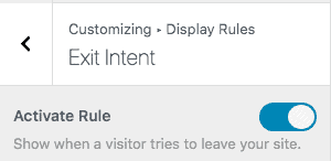
This will activate the plugin, and an exit-intent popup will show whenever a user leaves the site. Of course, it’s best to test it first and see how it looks before you start tracking the campaign.
Do Exit Intent Popups Actually Work?
The short answer? Yes, they do. In fact, they work better than conventional popups, with many users reporting an average increase of 5%. Here’s what an eCommerce store owner wrote regarding the effectiveness of exit-intent popups for their store:

According to KISSmetrics, the bounce rate of certain sites can go as high as 90 percent, depending on their niche. Here’s their breakdown:
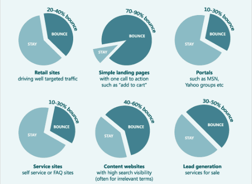
If done correctly, exit-intent popups can bring down your bounce rate by a considerable margin. However, plenty of people find exit-intent popups pesky. If you already have instant pop-ups configured on your store, exit popups will just anger your users more. Here’s an example:

Exit-intent popups are not the way to capture leads. Web marketers are using a variety of different techniques to attract users.
Exit-intent popups work, there’s no doubt about that. But they don’t work on everyone that lands on your website. So – here are examples of other solutions you can use alongside exit-intent popups to make it easier for visitors to find what they’re looking for and inevitably convert.
Live Chat
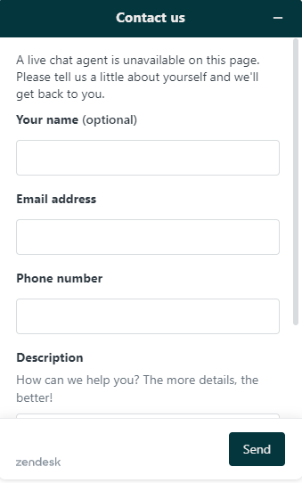
Live chat is the future. According to Gartner, more than 85% of businesses are expected to offer live chat support by the end of 2022. They cost less and convert more, making them an ideal choice for eCommerce store owners.
To start a live chat, the user is expected to enter their details. Once they do, the live chat launches. If an agent is not available, they can leave their email and their query. Studies have shown that customers who use live chat spend almost 60% more on their purchases.
Also, they increase conversion rates by almost 4%! By adding a small popup at the bottom that indicates an agent is online, you can easily converse with a customer and reap the rewards!
Browser Notifications
This is a slightly risky approach, primarily because almost every other website nowadays uses it. Push notifications from the browser are becoming increasingly popular, mainly because they can inform users of updates and new content even if they are not using the site.
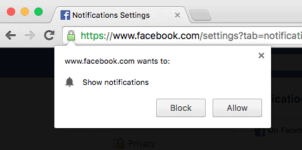
This is great because you can easily send interesting or sensational notifications to your users and see how they respond. However, you still have to ask the users before opting them in. It’s essentially a popup that appears as soon as the website loads. Why would an average user agree to receive notifications from you without even checking your content first?
That’s why you need to be careful when opting for browser notifications instead of exit-intent popups.
Summary: MailOptin + Exit Intent Popups = A Conversion Powerhouse
There’s no question exit-intent popups work, but you need to test different offers & messaging to find out what truly resonates with your visitors.
Some of the key variables you can test in this context includes but not limited to –
- Type of lead magnet
- Type of opt-in form (EG: exit intent popup)
- Display rules and triggers
- Audience segments
- Value proposition headline
- Landing page
- Call to action button
- Content upgrade
- Traffic sources etc.
Fortunately, testing all of this is extremely easy with the help of MailOptin’s built-in A/B testing functionality.
Put it this way, people seeing any of your exit-intent popups are already about to leave your website anyway. They’re already about to abandon the tab – so it’s your last chance to get their attention at that moment. While it is one of the many points of contact you are going to share with a potential consumer, it could very well be the last as well. But, if done correctly, it could effectively cause a 180-degree turn, and a customer heading out the door might return to buy something from you (whether immediately or as a result of an email campaign they receive weeks down the line that resonates).
Even a 1% increase in your conversions could have a huge impact on your top-line growth. Give MailOptin A Try Today.
